Description: A clear, professional website for a training institution in Kigali that helps people and businesses build practical skills.
About
HCA Kigali is a professional training institution in Kigali, Rwanda, and a member of the global Hubbard College of Administration network. It teaches practical leadership, management and organisation skills to individuals, entrepreneurs and organisations. Through hands-on courses, seminars and coaching, it helps learners apply what they learn, grow in their careers, strengthen their businesses and get real results at work.

Objectives
Design a professional, accessible website that reflects HCA Kigali’s mission to empower people and businesses.
Present courses, seminars and training programmes in a clear, structured way.
Make the site easy to use, with simple navigation and well-organised information.
Build trust by showing the global Hubbard College affiliation and the practical, results-driven approach.
Increase course applications and seminar registrations with clear calls to action.
What we did
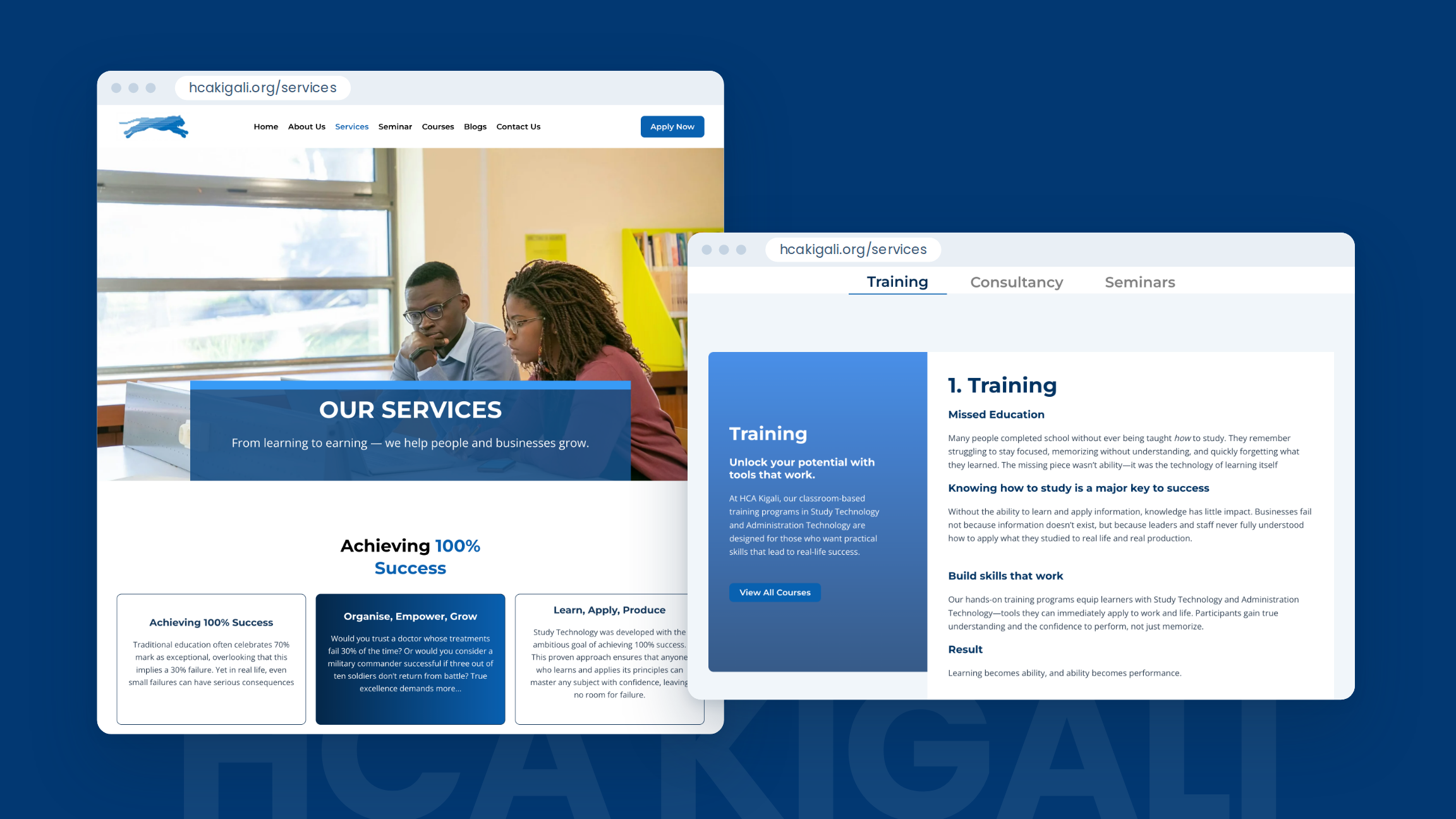
We designed the full website experience: the home page, about, services, courses, seminars, admission, blog and contact pages.
Our approach
We put the learner’s goal first. The home page opens with “Elevating the Rwandan Workforce” and speaks directly to people looking for a job, growing a business or aiming for a promotion.
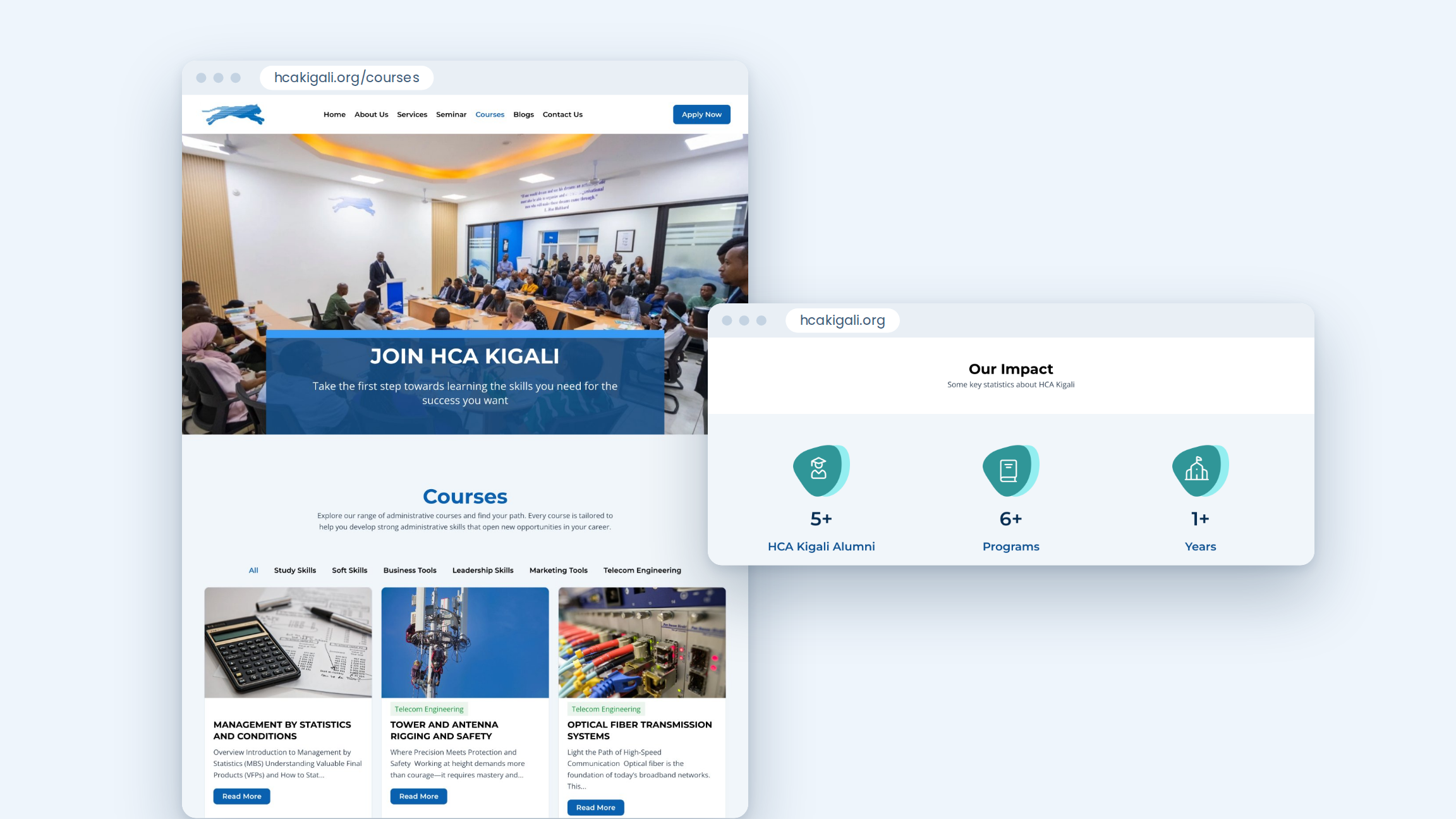
We made the next step always clear. An “Apply Now” button sits in the header on every page.
We made courses easy to find. The courses page lets visitors filter by category, such as Study Skills, Leadership Skills or Telecom Engineering. Each course card shows a short summary and a “Read more” button.
We made applying feel simple. The admission page breaks the process into six clear steps, from first enquiry to the start of classes, with the application form right below.
We built trust throughout the site, with the Hubbard College connection near the top of the home page, the institution’s values, its leadership team, graduate testimonials and photos from real events.
We kept one clear visual style: a strong blue, bold headings, and a blue text panel over large photos at the top of every page. This gives the site a calm, professional feel.