About the Brand
Our Story
Combining Africa’s cultural richness with innovative design solutions
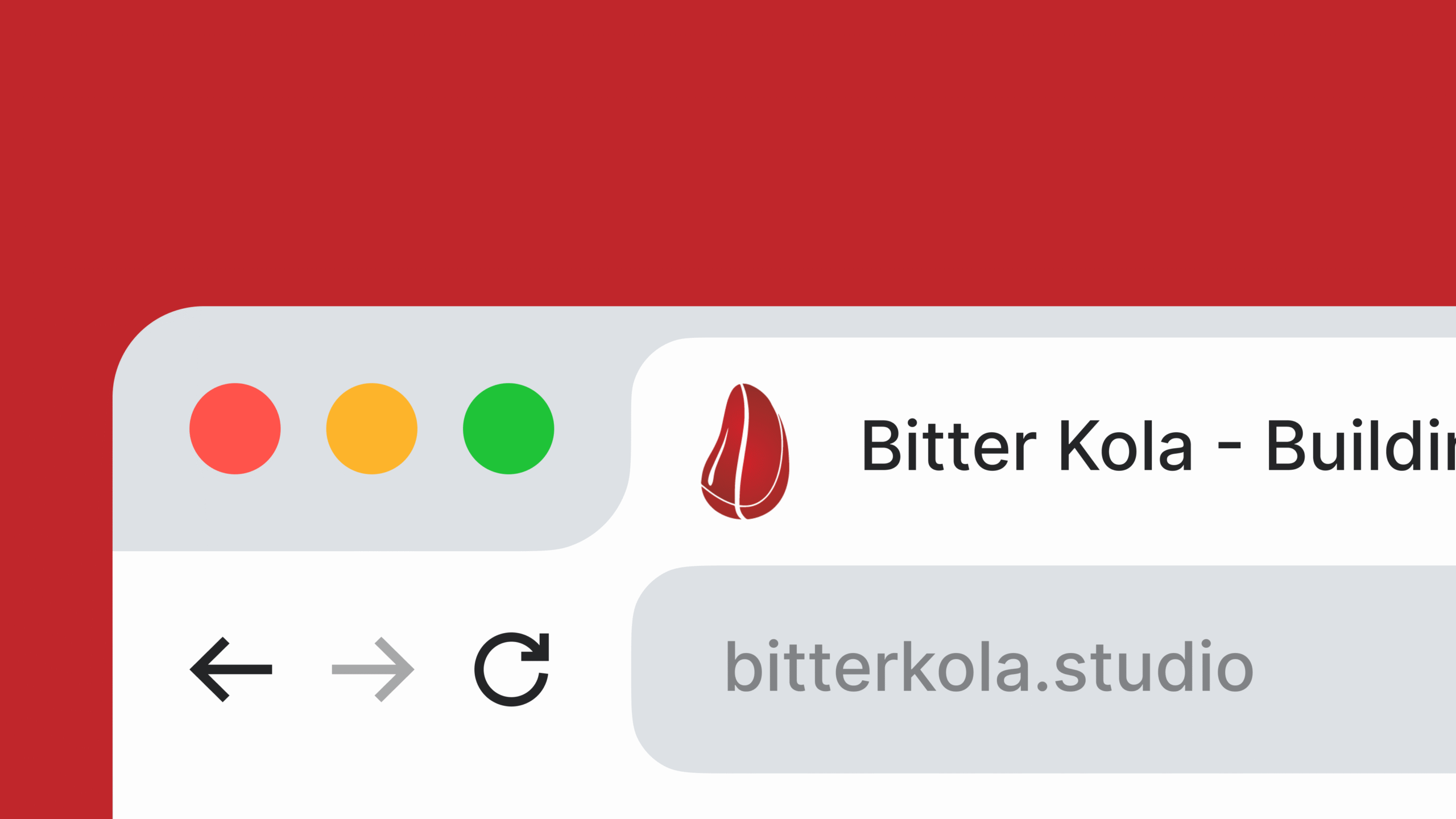
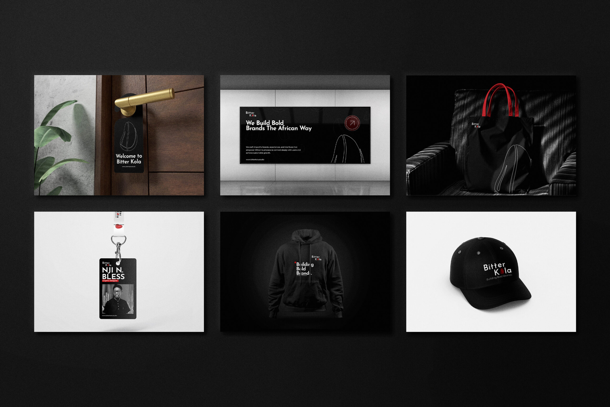
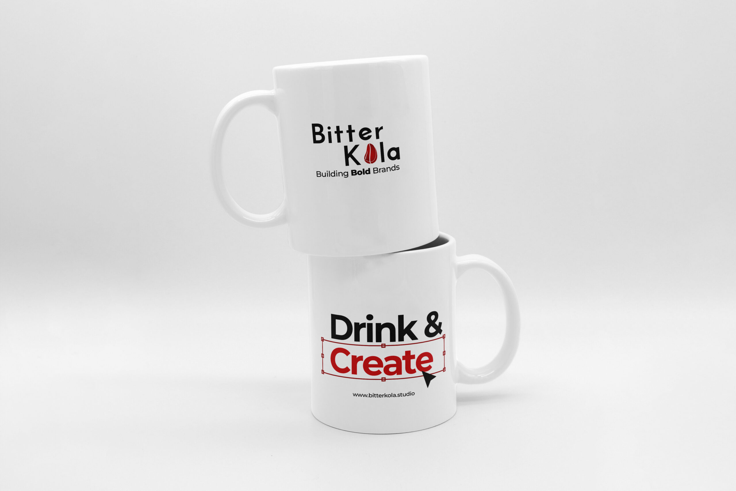
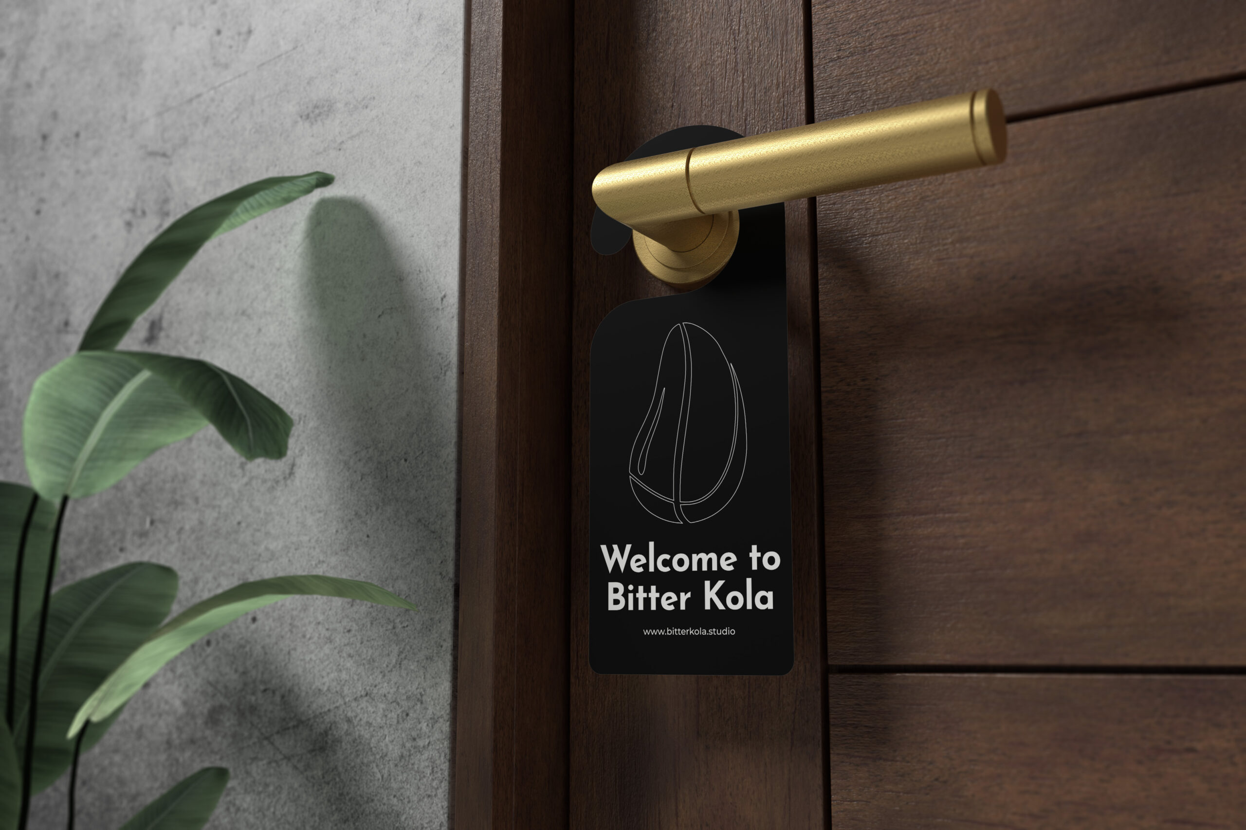
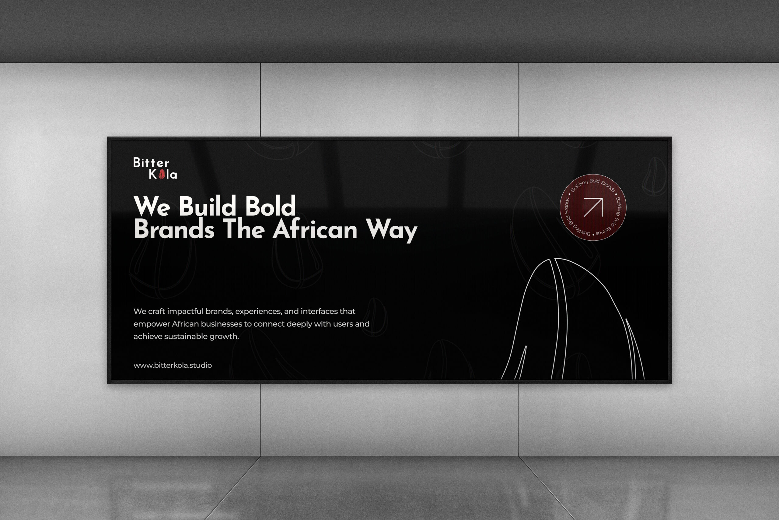
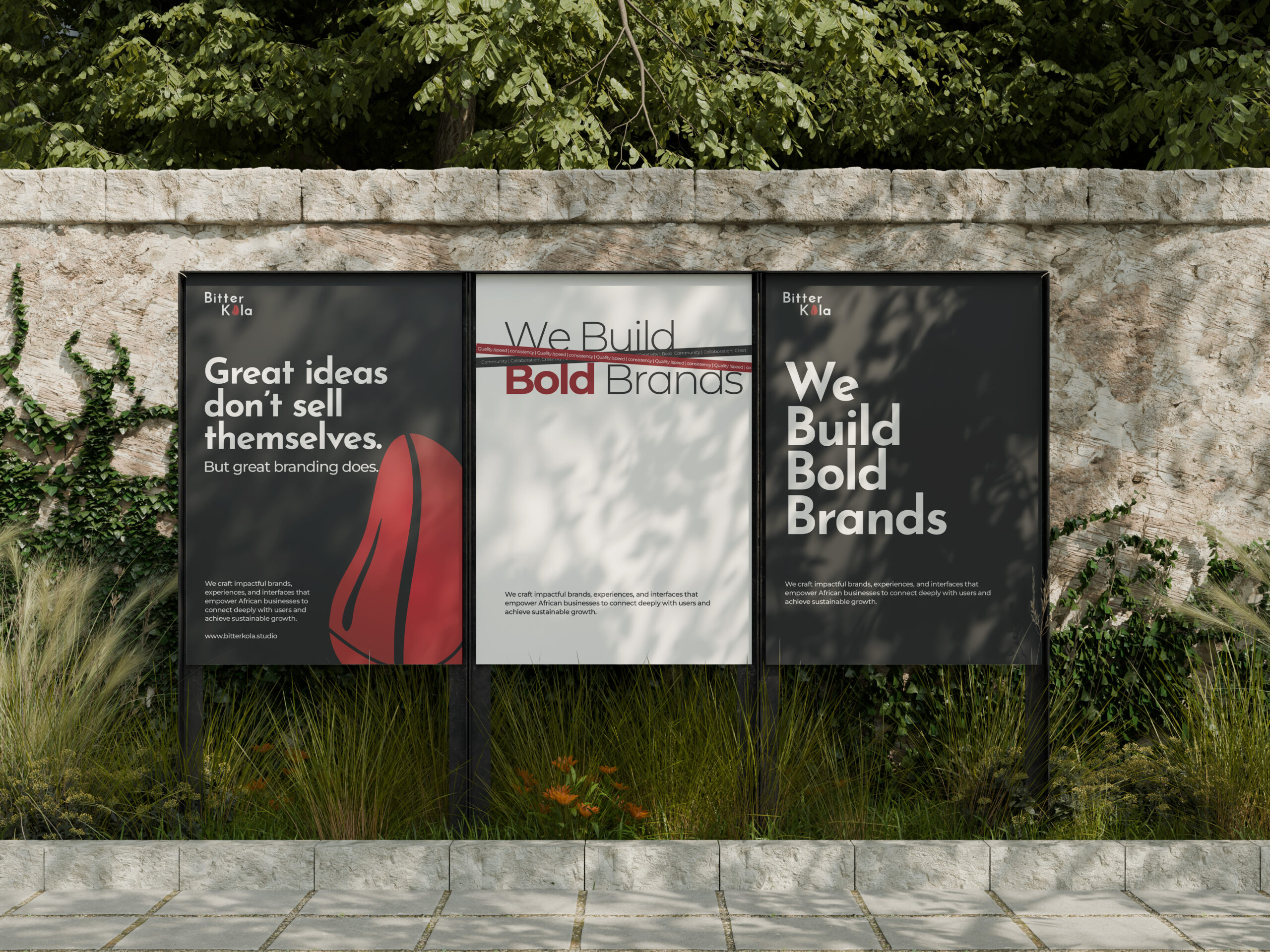
Bitter Kola was founded with a simple mission: to empower African businesses through design. Drawing inspiration from the Kolanut, a fruit that symbolizes unity and collaboration, we aim to strengthen the connection between businesses and their audiences through authentic visual communication. By fusing creativity with a deep understanding of African culture, we deliver solutions that are both functional and culturally resonant.
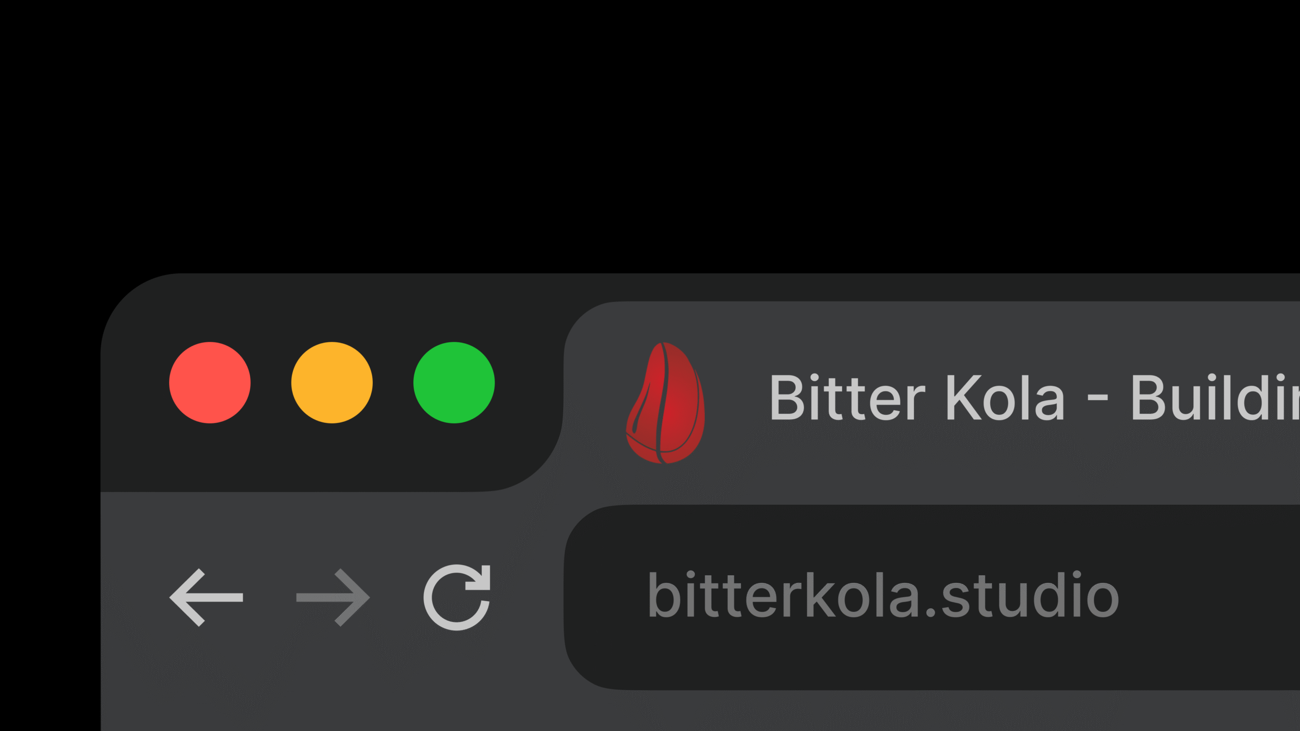
About Logo
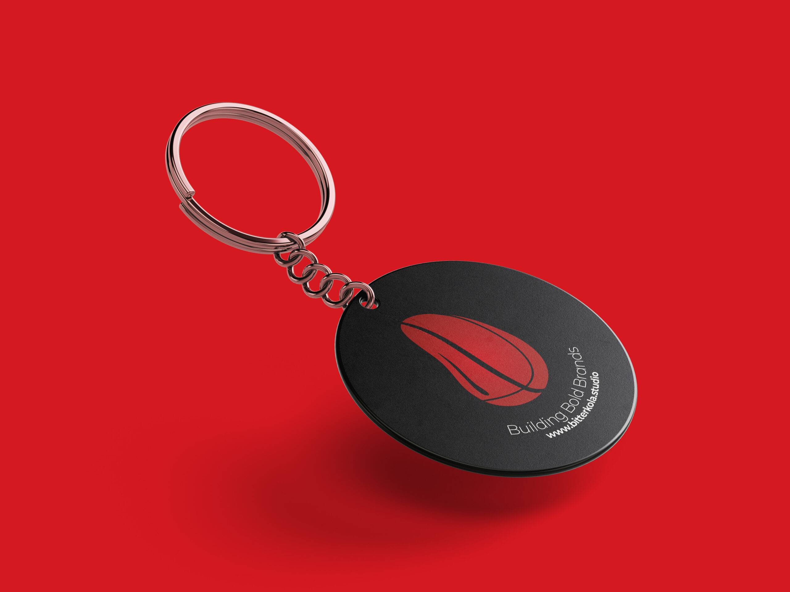
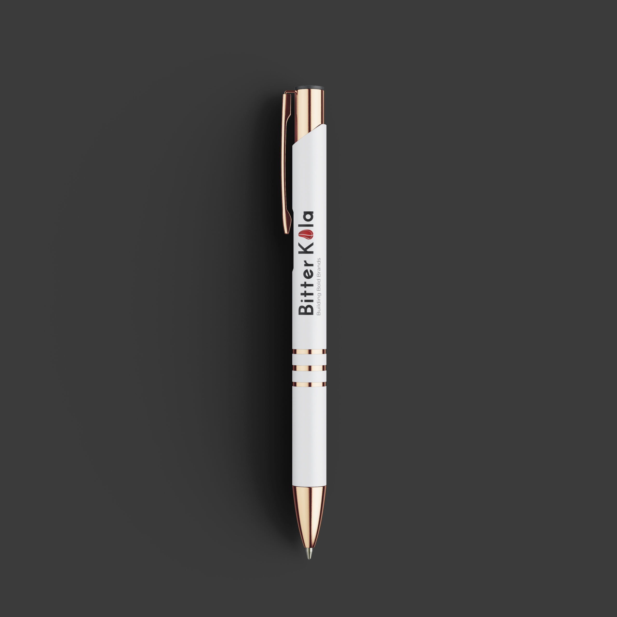
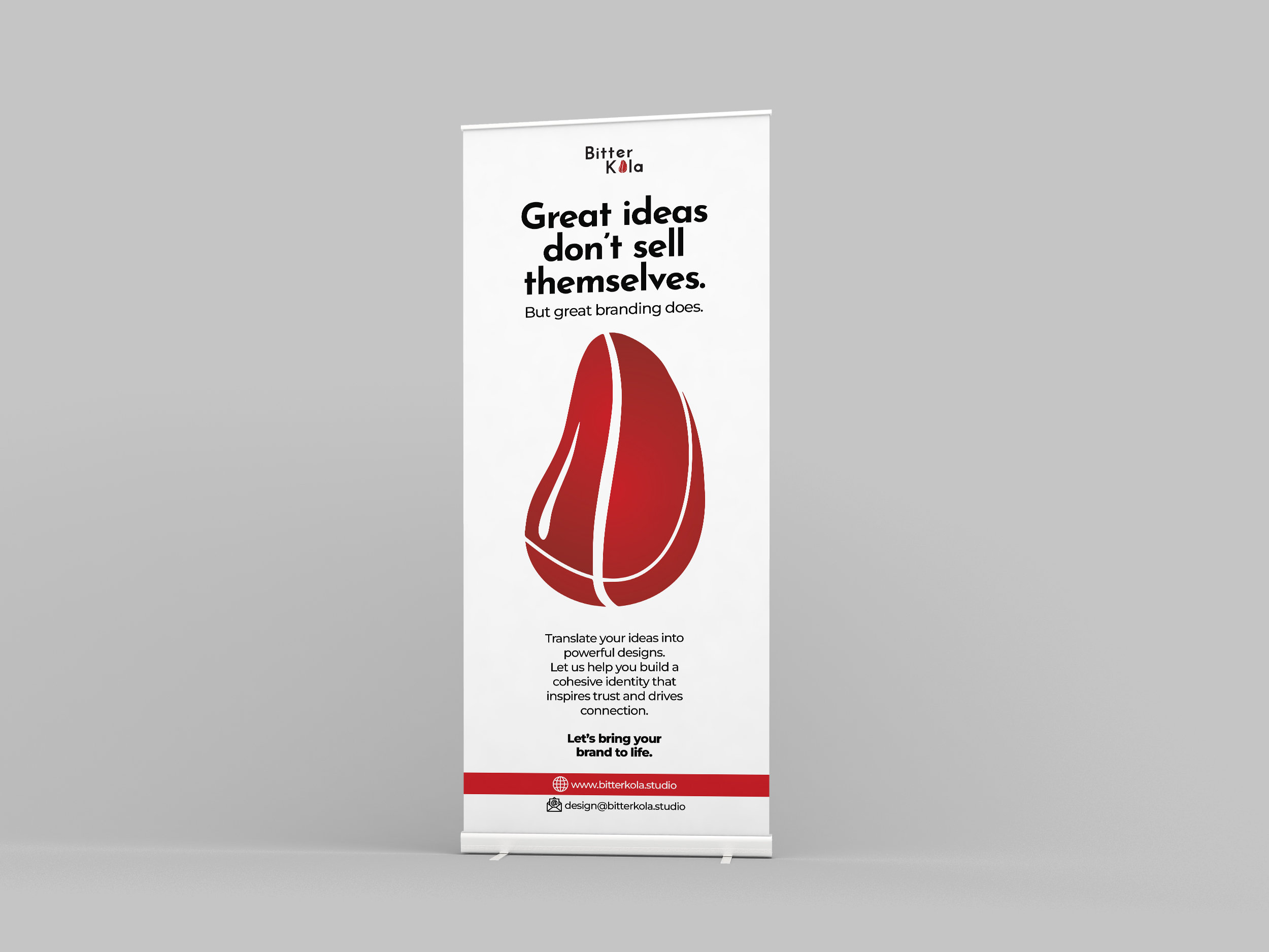
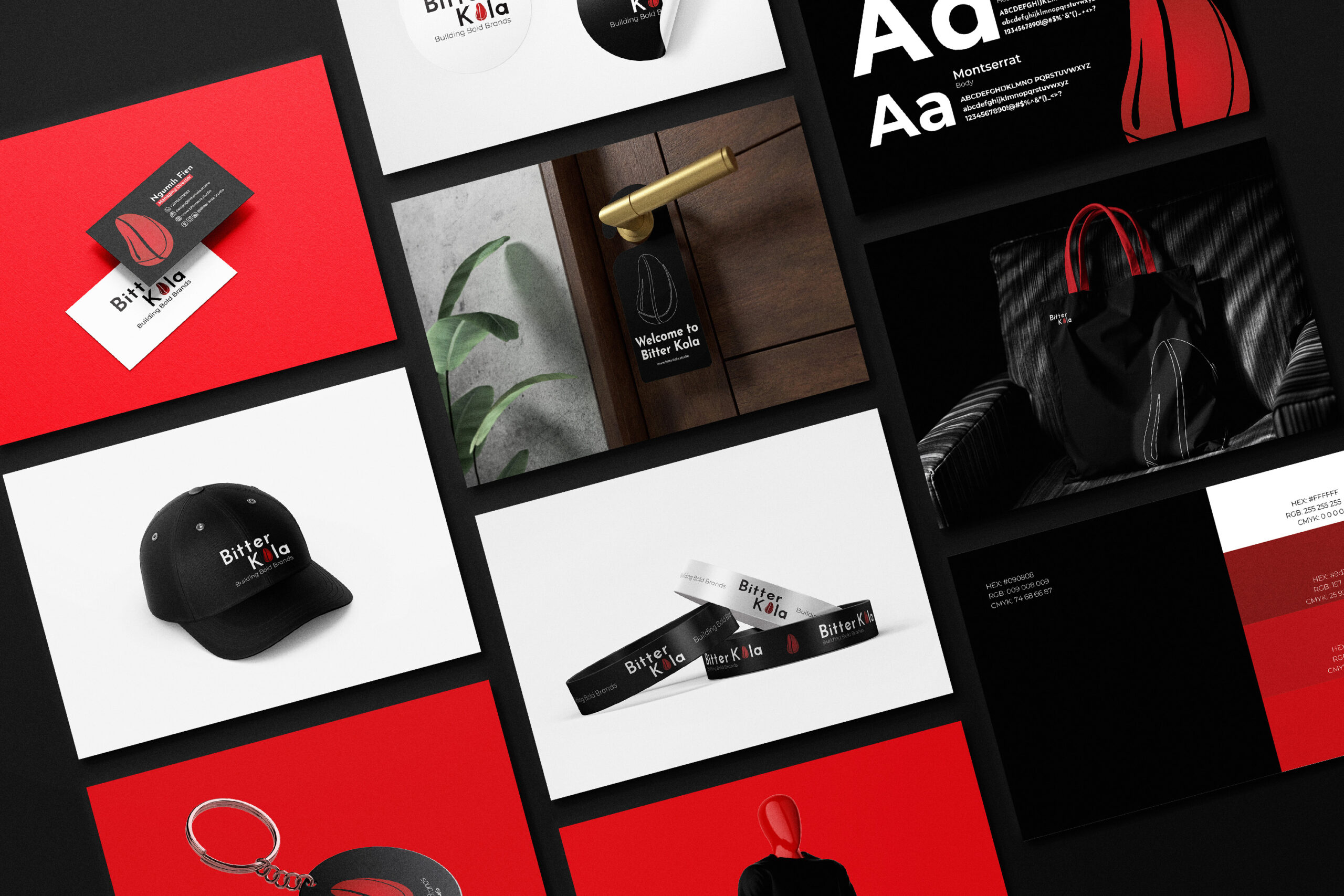
Drawing inspiration from the Kolanut, a fruit that symbolizes unity and collaboration, Bitter Kola Studio aims to strengthen the connection between businesses and their audiences through authentic visual communication.
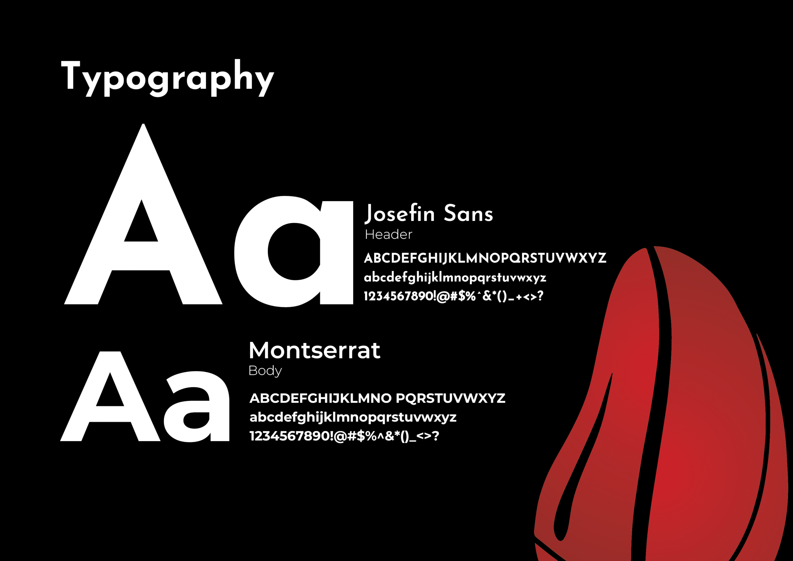
Typography Brief
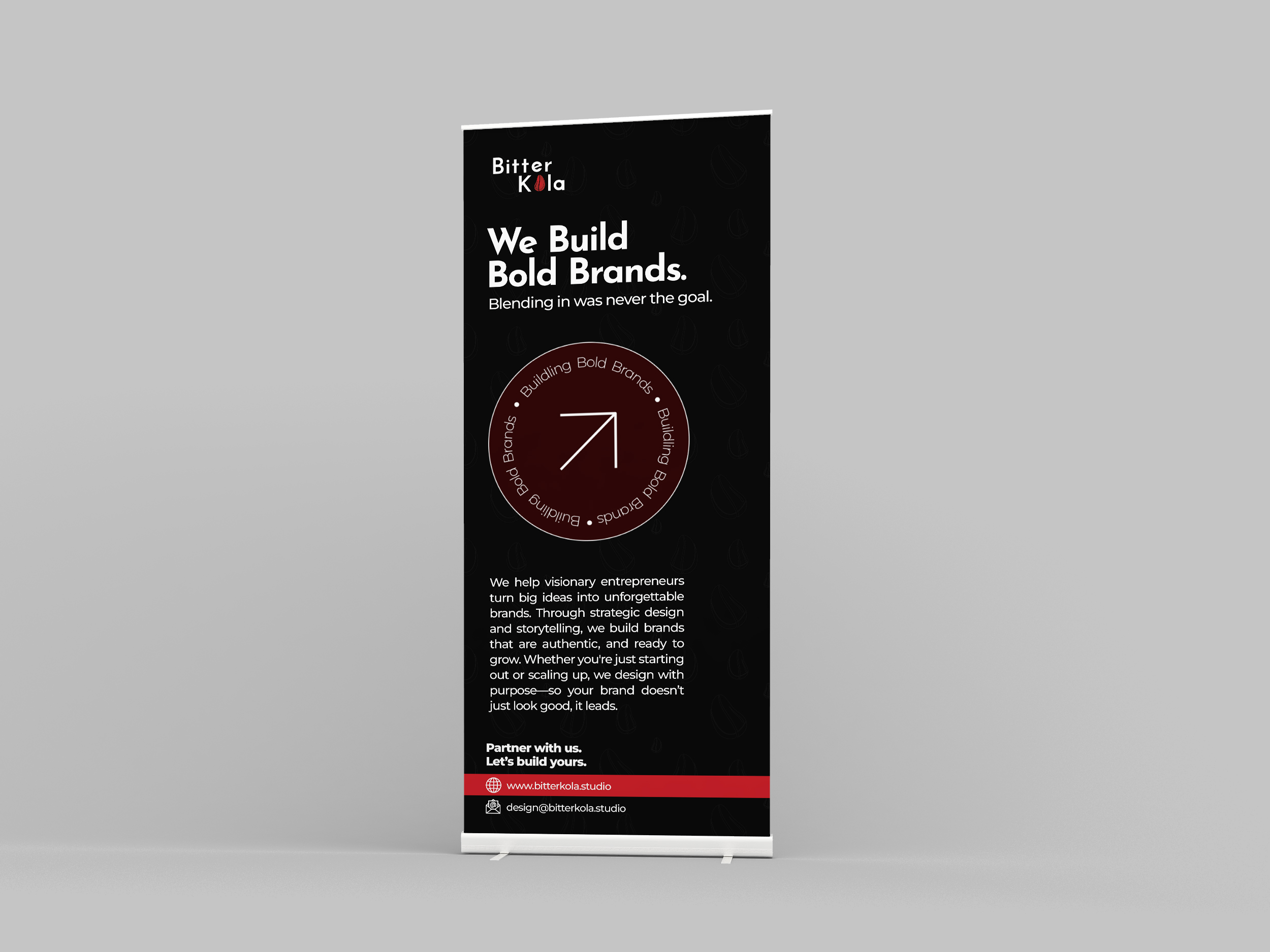
Primary Typeface – Josefin Sans (Headers & Display)
Josefin Sans brings a modern yet timeless character to our brand identity. Inspired by geometric and Scandinavian design styles, it features clean lines, elegant curves, and a minimalist aesthetic. As our primary display font, it conveys creativity, sophistication, and contemporary style, making it ideal for headlines, titles, taglines, and brand statements. Josefin Sans reflects our studio’s innovative spirit and commitment to refined visual expression.
Secondary Typeface – Montserrat (Body & Supporting Text)
Montserrat serves as our secondary or body font, providing strong readability across both digital and print platforms. Inspired by urban signage, it has a modern professional tone with excellent versatility. Paired with Josefin Sans, Montserrat balances aesthetics with clarity, ensuring a smooth reading experience across long-form text, captions, descriptions, and UI elements.
Typography Relationship & Brand Expression
Together, Josefin Sans and Montserrat create a refined and balanced visual system. The contrast between Josefin’s character-driven style and Montserrat’s functional clarity allows our typography to feel bold yet approachable, creative yet structured. This pairing mirrors the essence of our design studio—innovative thinking grounded in purposeful execution.
Color Palette
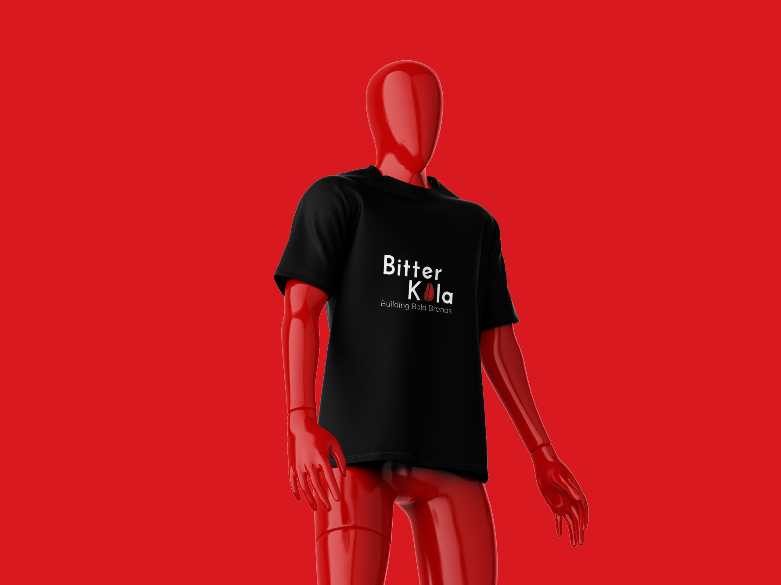
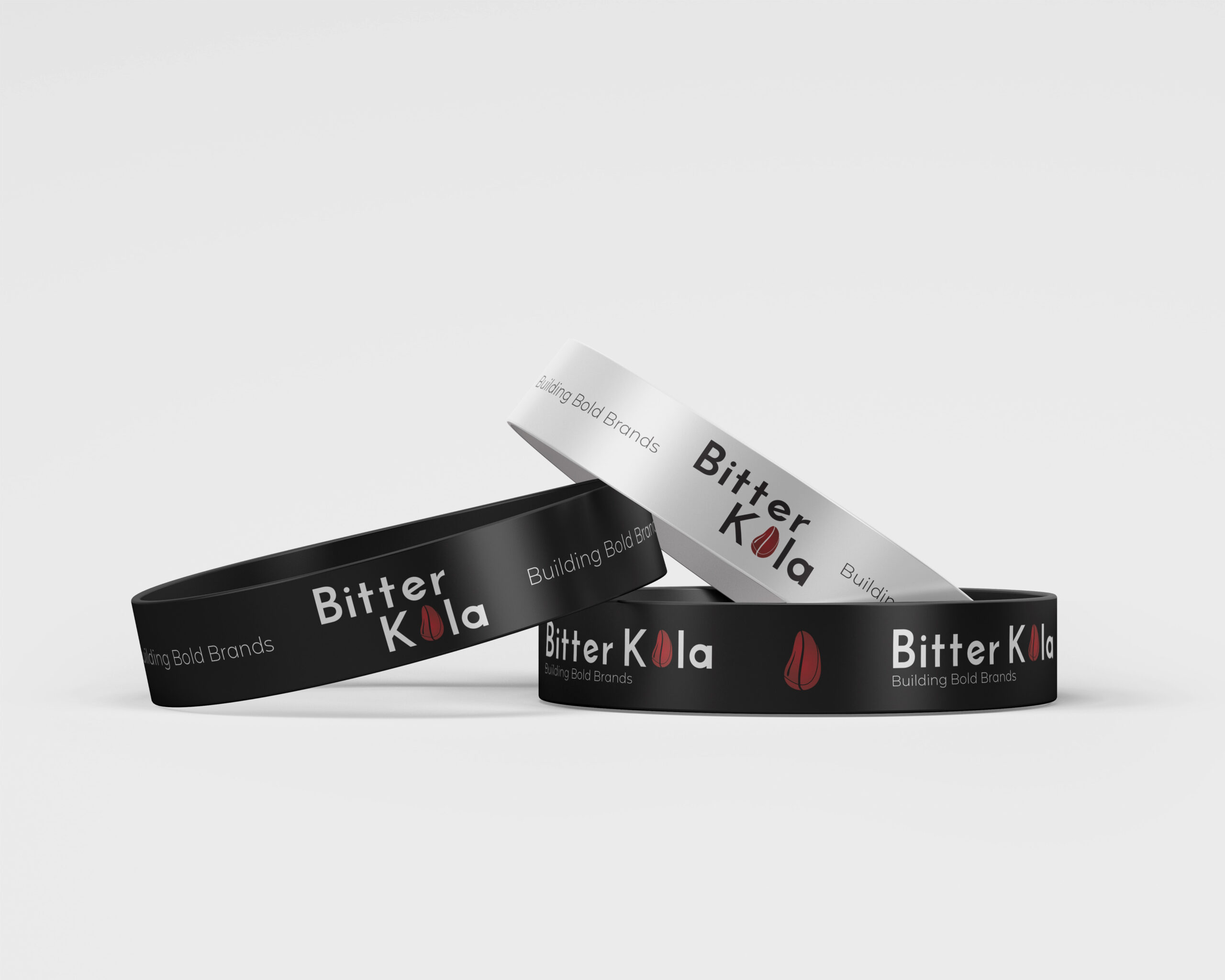
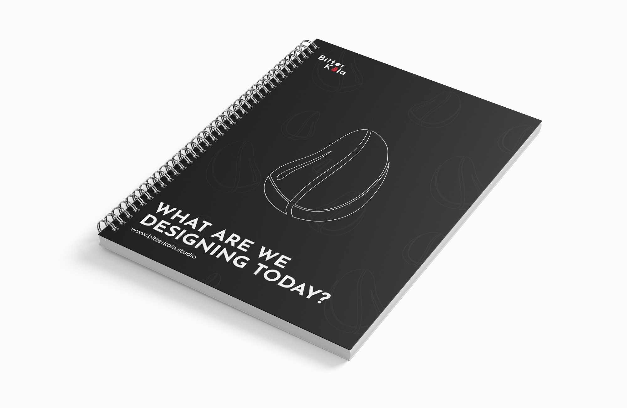
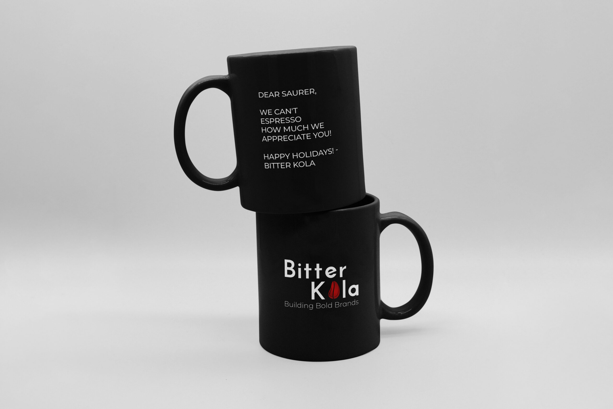
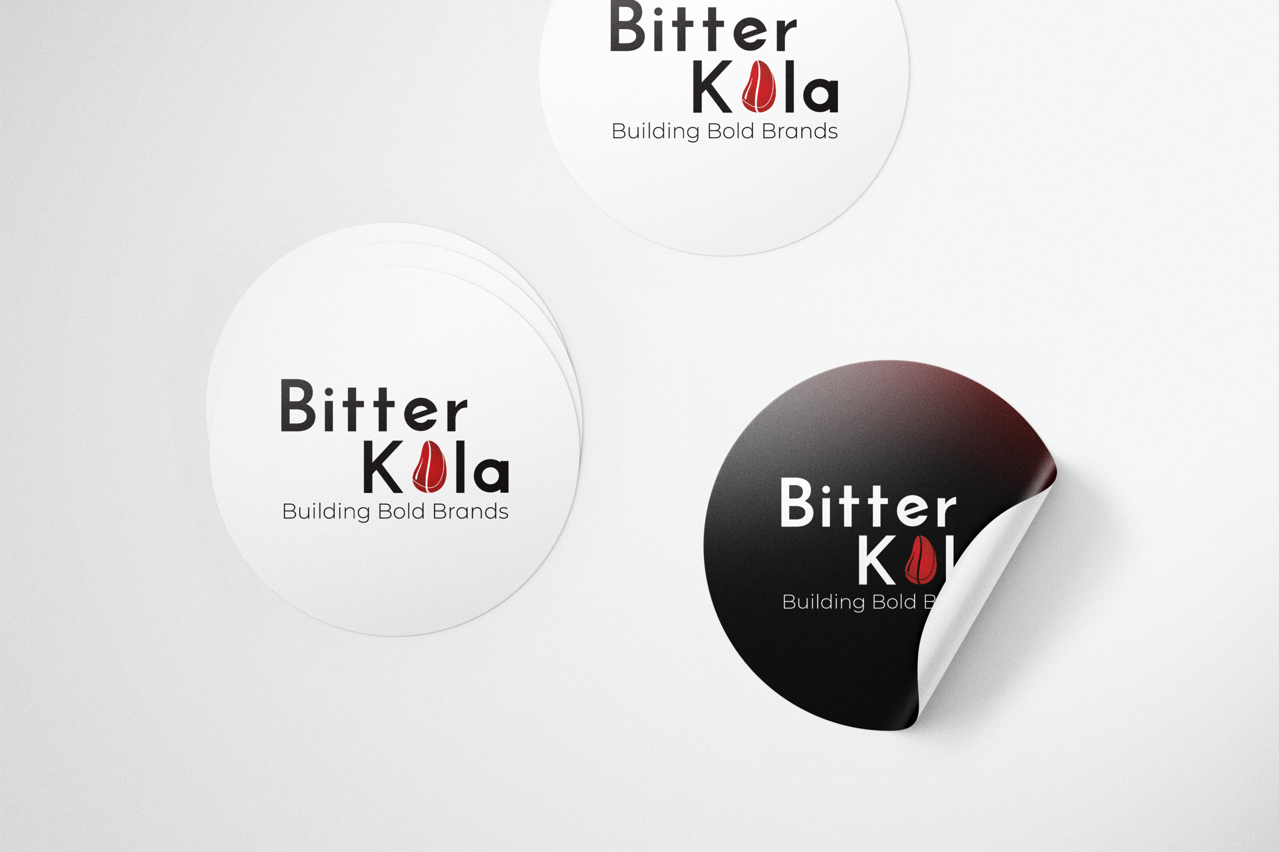
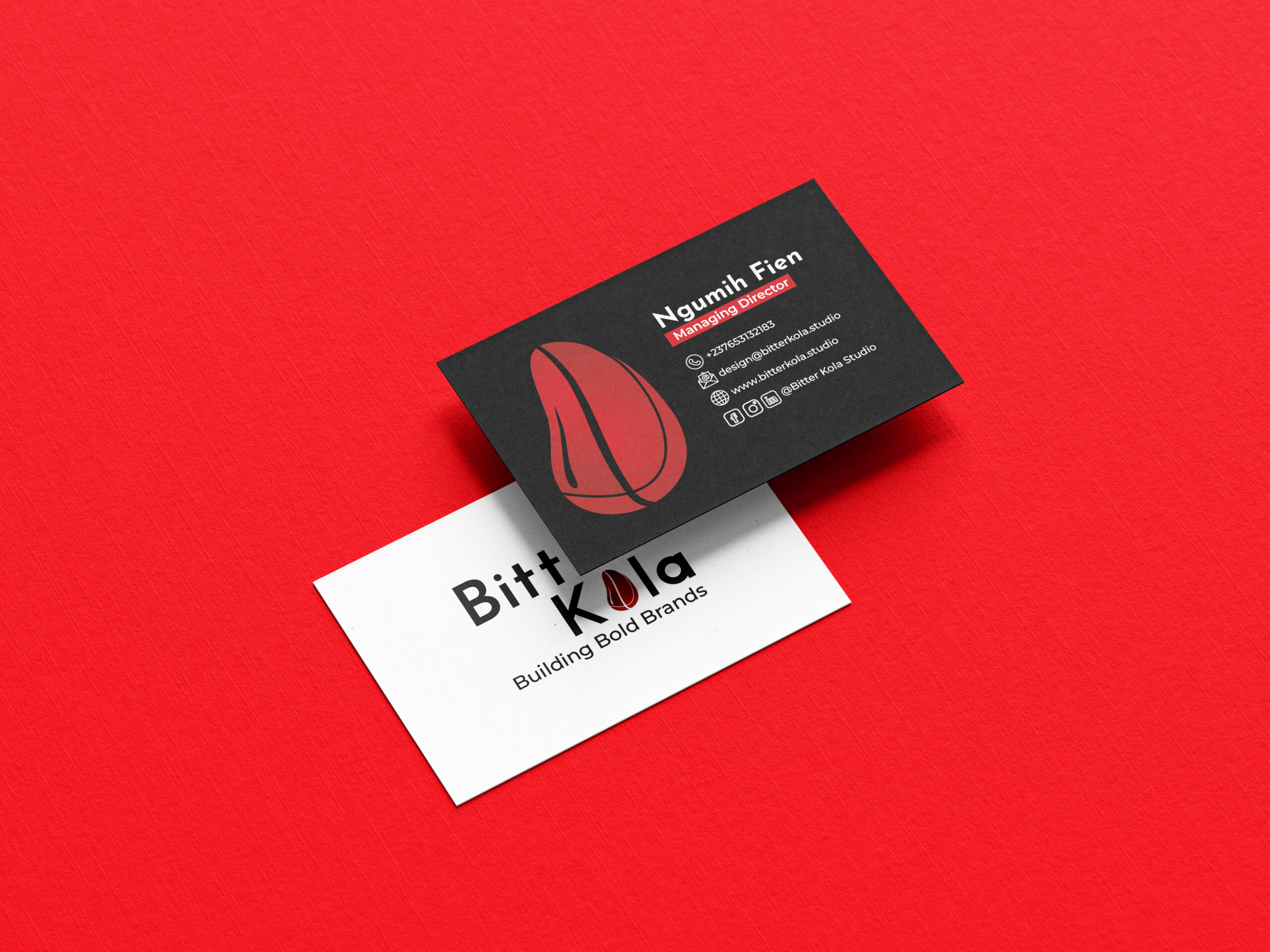
Primary Color – Midnight Black (#090808)
Midnight Black defines the foundation of our brand identity. Bold, timeless, and refined, it communicates strength, clarity, and design authority. As our dominant color, it reflects our studio’s minimalist philosophy—letting purposeful design speak louder than decoration. This deep black tone establishes a confident visual presence across all brand expressions, from digital interfaces to print materials.
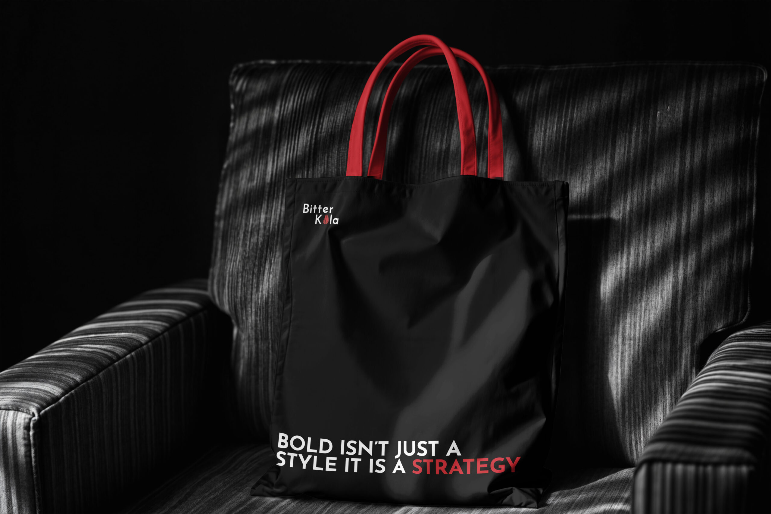
Accent Color – Crimson Red (#C0262B)
Crimson Red injects personality and emotion into our brand. Used as an accent color, it adds energy, passion, and emphasis to key elements. This striking red draws attention strategically—guiding visual hierarchy and amplifying important messages. It symbolizes creativity, ambition, and bold identity—perfect for call-to-actions, highlights, and brand expressions where impact matters.
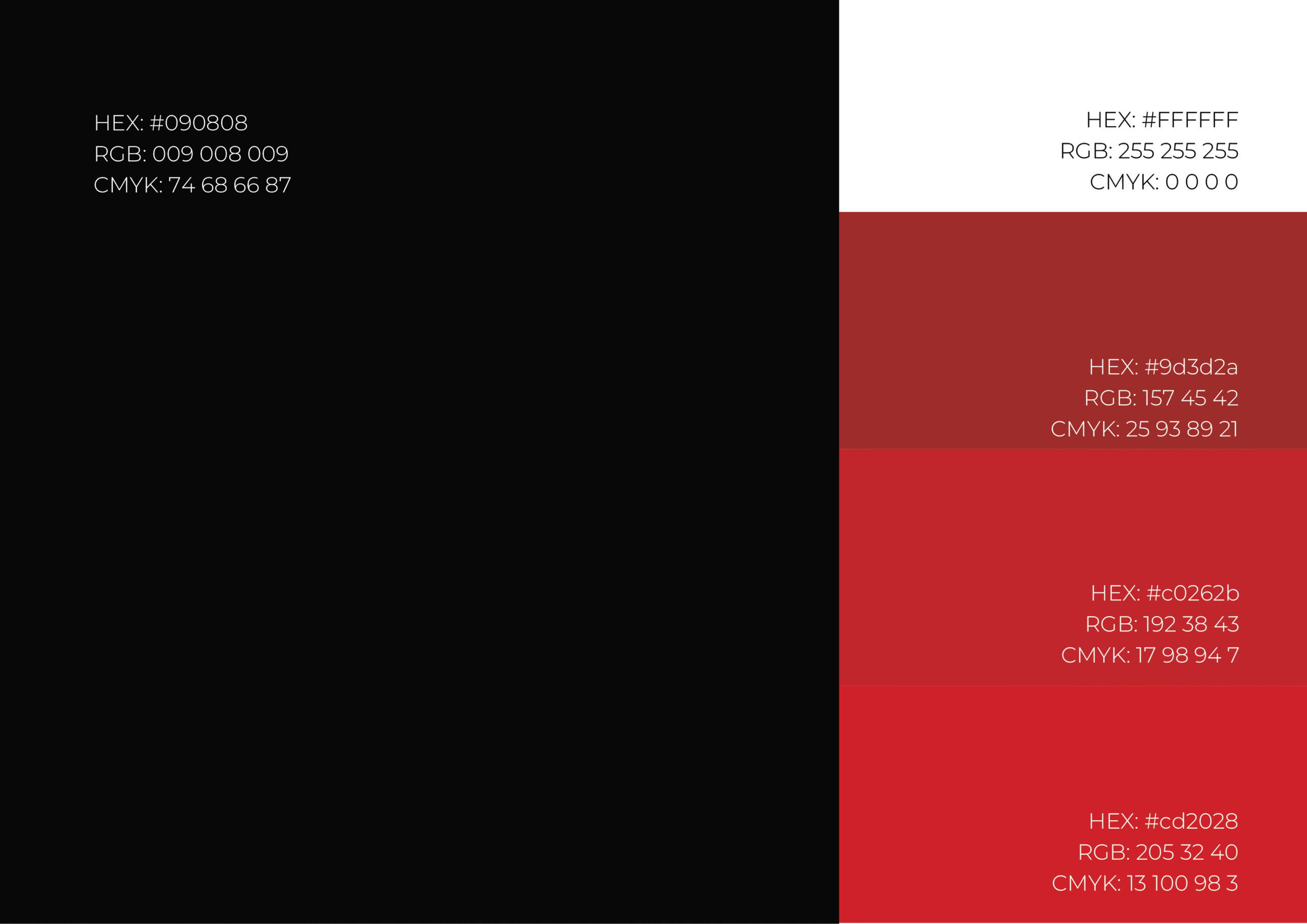
Together, #090808 (Midnight Black) and #C0262B (Crimson Red) create a compelling color system—grounded yet dynamic, disciplined yet expressive—reflecting the dual nature of our studio: creativity with purpose.