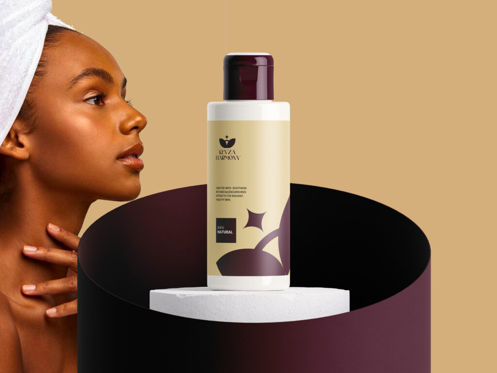
About Keyza Harmony: Keyza Harmony is built on the belief that nature holds the key to unlocking true skin radiance. They create skincare that thoughtfully blends carefully chosen botanicals with gentle science, resulting in harmonious formulas that nourish, protect, and revitalize. Every product is designed to support balance and well-being, helping individuals achieve a naturally healthy glow without compromise.
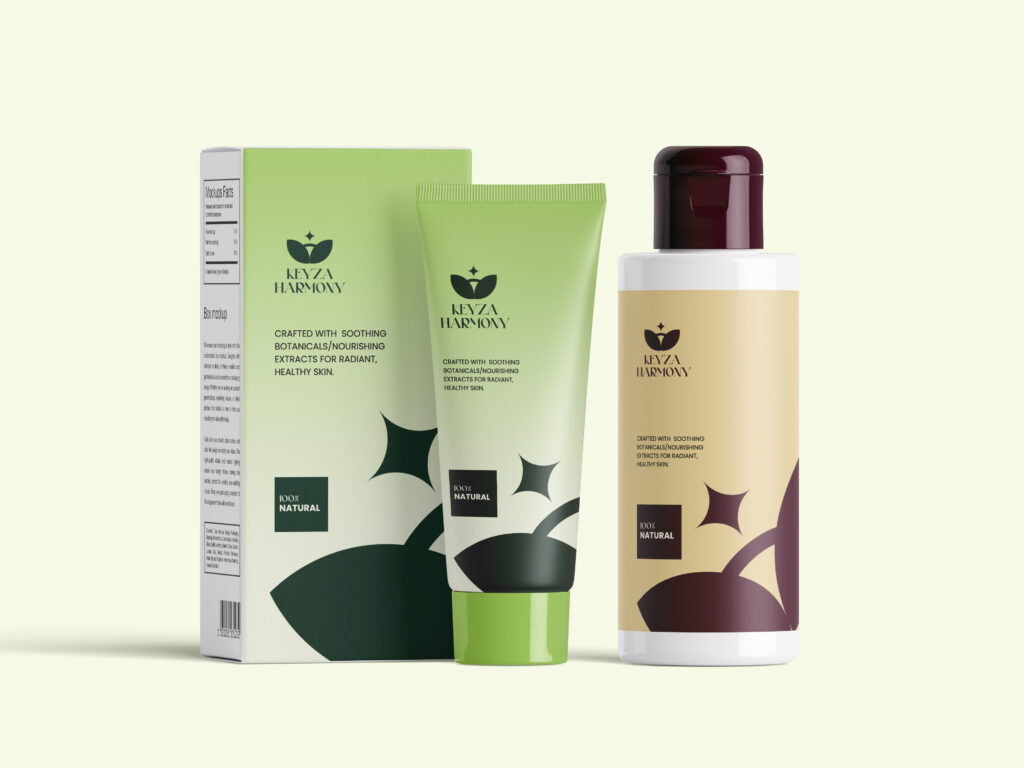
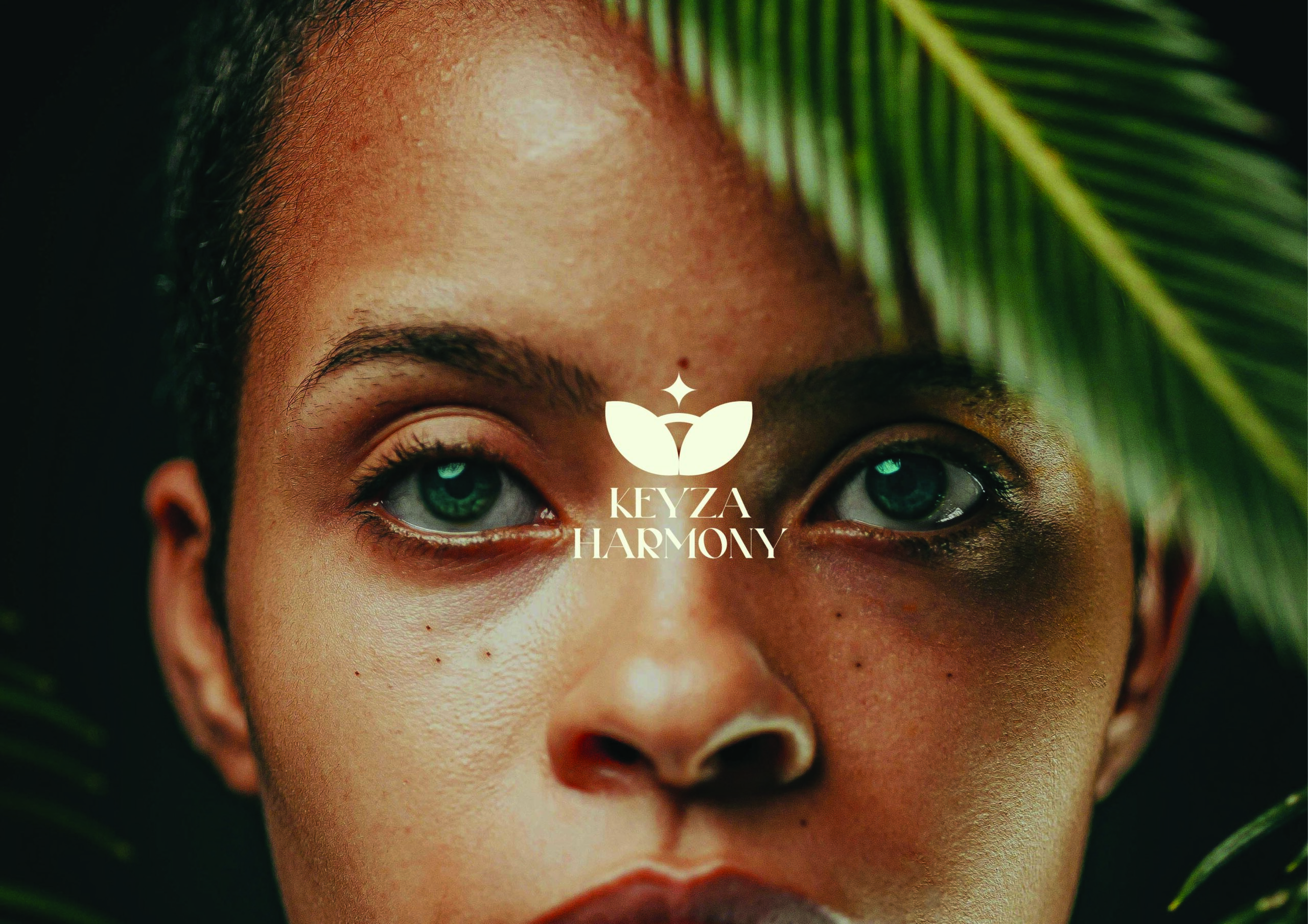
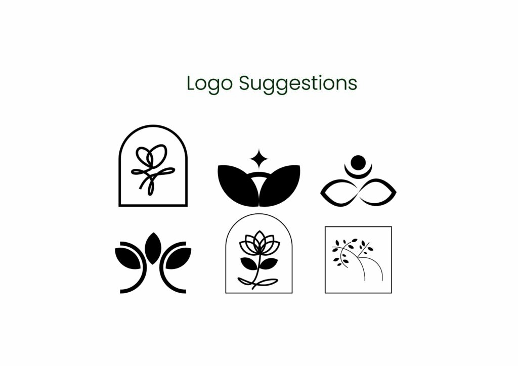
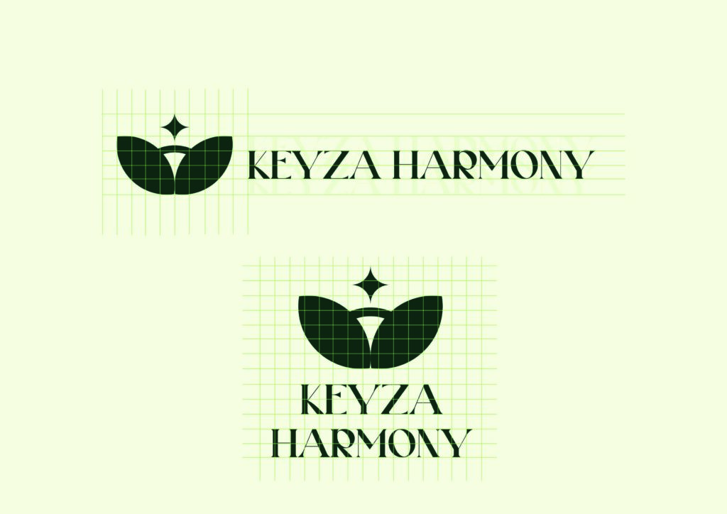
Objectives: Bitter Kola Studio developed Keyza Harmony’s brand identity to capture the essence of natural beauty and balance. The logo blends a flower, representing harmony, sustainability, and connection to nature, with a subtle sparkle that evokes radiance and elegance. This design conveys the luxurious, nurturing, and revitalizing qualities of Keyza Harmony’s skincare, reflecting its commitment to naturally glowing, healthy skin.
Bitter Kola studio Brand identity strategy for Keysa Harmony, Logo Design: We use a Flower and Sparkle; The flower embodies harmony and balance. It emphasises Keyza Harmony’s connection to nature and sustainability, adding a graceful touch + A subtle glowing sparkle radiates from the design. It represents a natural beauty and essence of Keyza Harmony products, enhancing the logo’s luxurious feeling.
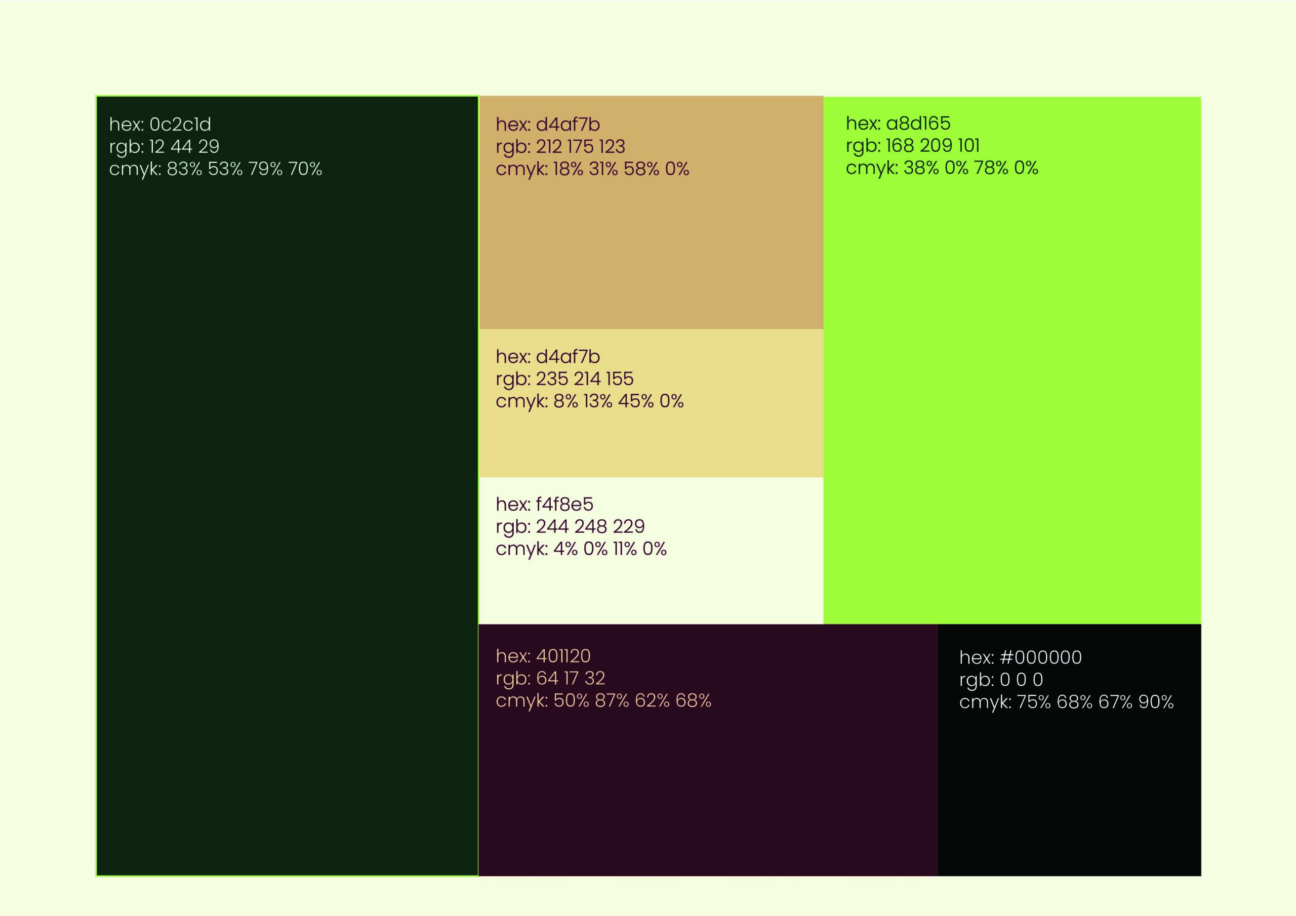
Colour palettes: The colour palette features a diverse range of hues, including:
– Deep Green-Brown: #0C2C1D (R: 12, G: 44, B: 29)
– Warm Beige: #D4AF7B (R: 212, G: 175, B: 123) and a lighter variant #EBD69B doesn’t match your RGB so I used #D4AF7B’s rgb (R: 212, G: 175, B: 123)
– Soft Cream: #F4F8E5 (R: 244, G: 248, B: 229)
– Rich Burgundy: #401120 (R: 64, G: 17, B: 32)
– Fresh Green: #A8D165 (R: 168, G: 209, B: 101)
– Deep Black: #000000 (R: 0, G: 0, B: 0)
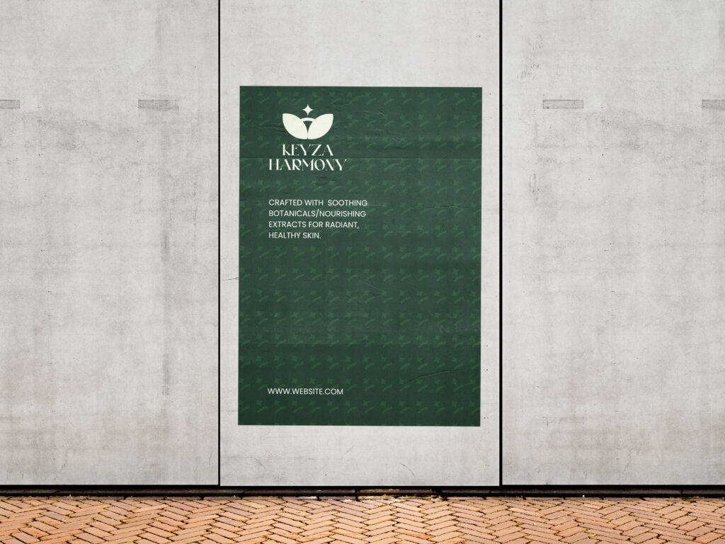
Pattern:The pattern features intricate, swirling shapes that evoke a sense of natural elegance and harmony, subtly incorporating a glowing sparkle effect that radiates from the design, symbolizing the essence of Keyza Harmony products and their commitment to natural beauty.