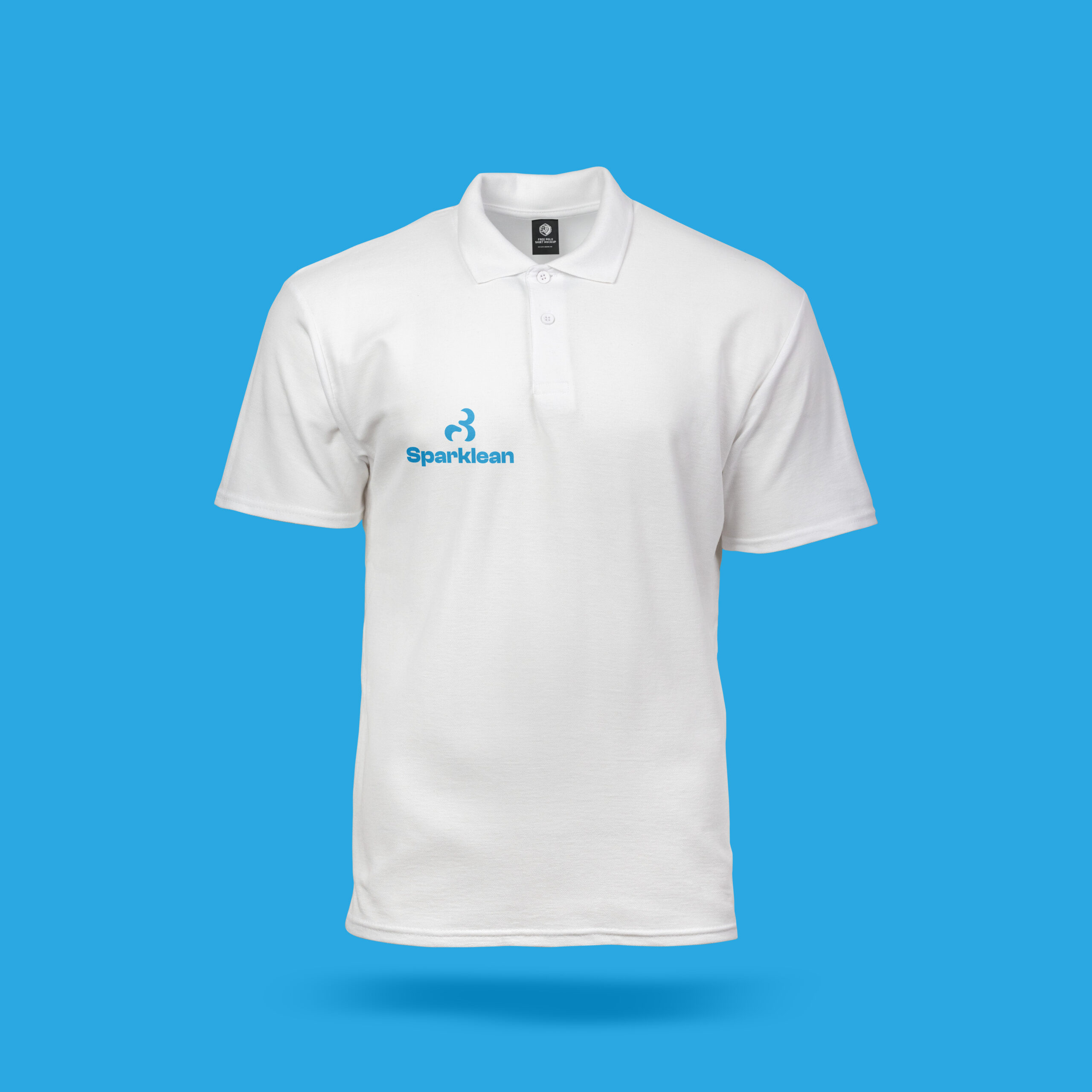
About Sparklean: Sparklean is a modern cleaning agency dedicated to transforming spaces with cleanliness, precision, and care. They provide professional cleaning services for homes, offices, and commercial properties, combining efficiency, attention to detail, and a human touch. Committed to well-being, productivity, and peace of mind, they deliver eco-friendly, client-focused solutions that leave a lasting sparkle and reflect trust, reliability, and quality.
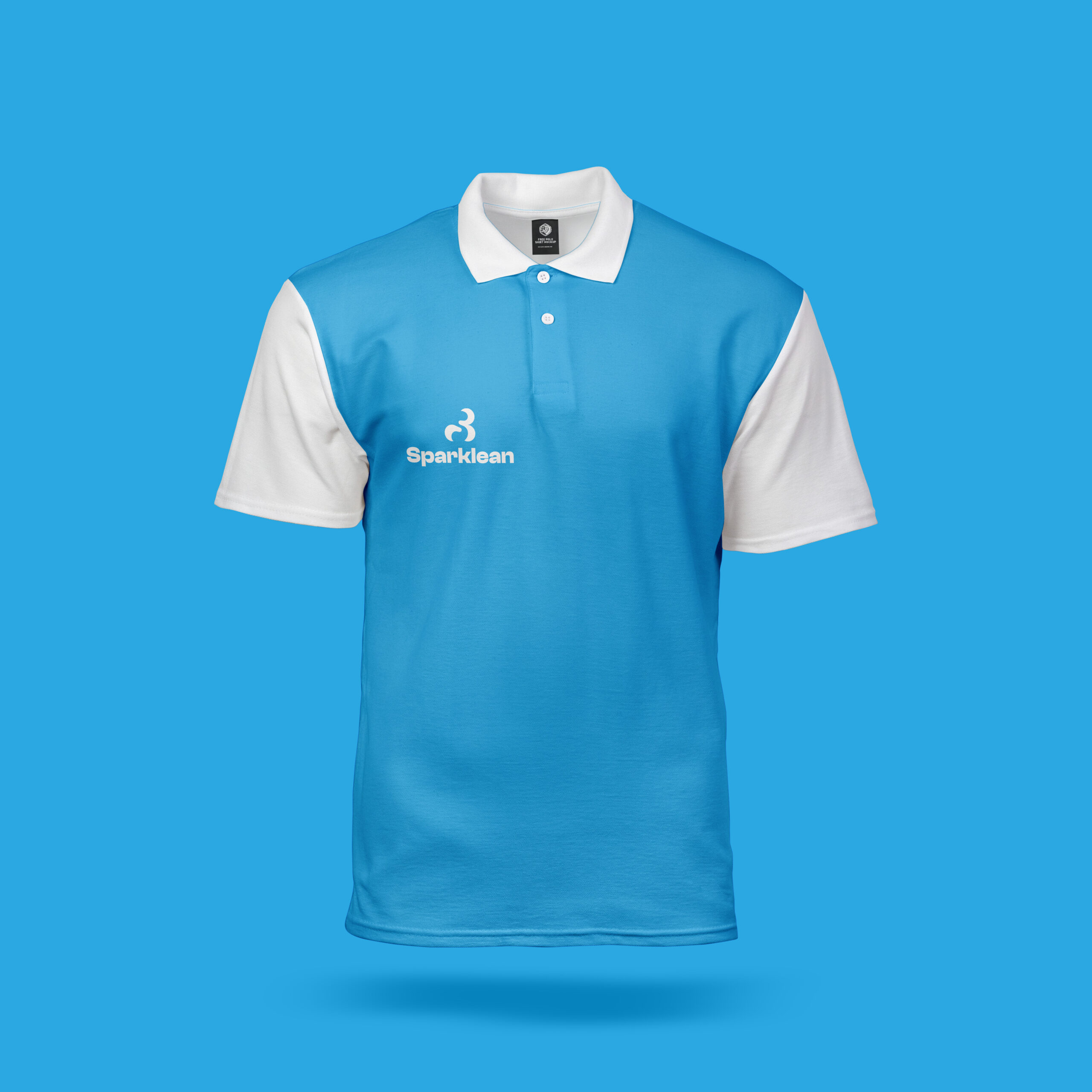
Objectives: Bitter Kola Studio designed Sparklean’s brand identity to reflect its promise of cleanliness, reliability, and care. The logo and visual system were crafted to embody precision and trust while remaining adaptable across different platforms. With a fresh, modern aesthetic, the identity communicates Sparklean’s eco-friendly approach and commitment to transforming spaces with efficiency and a lasting sparkle.
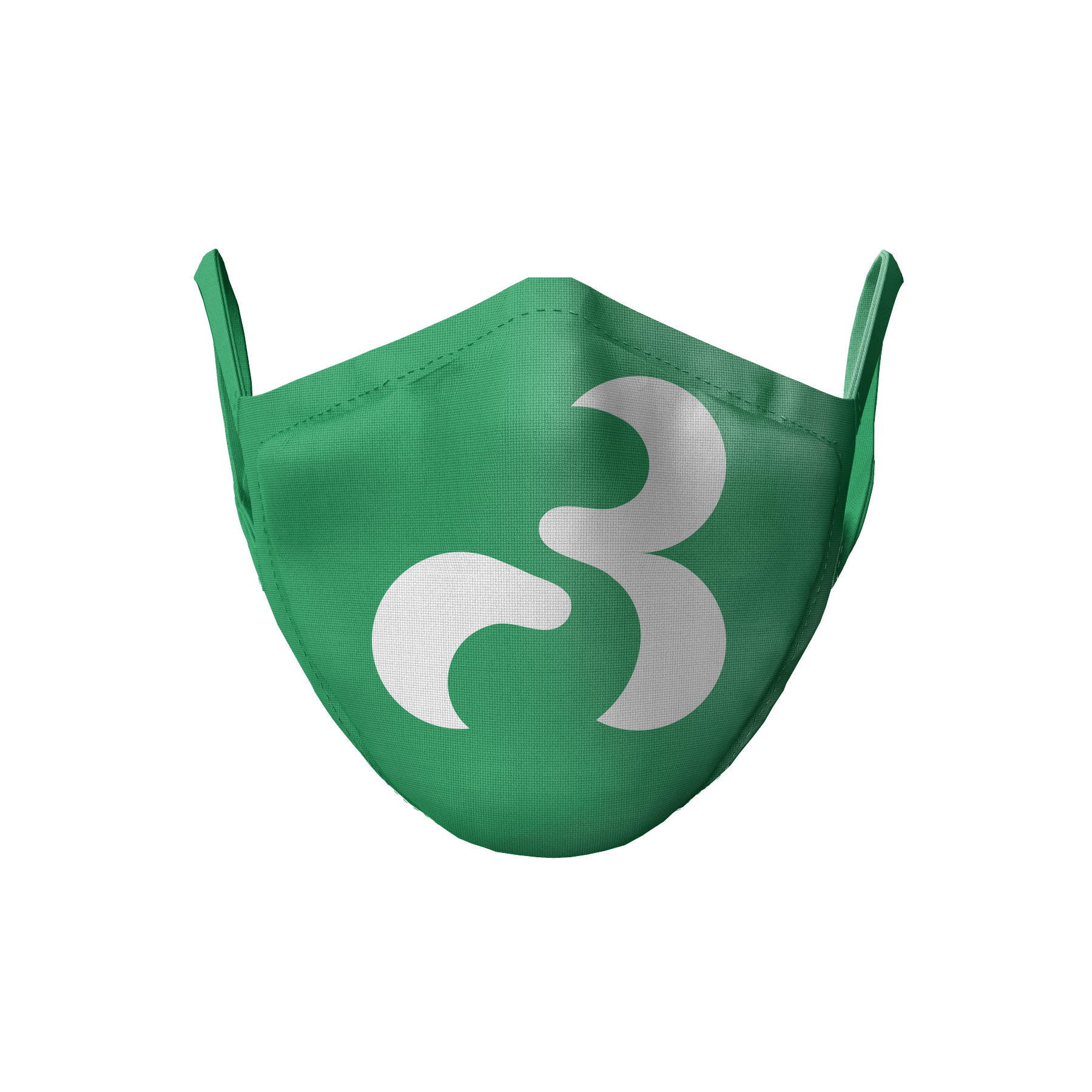
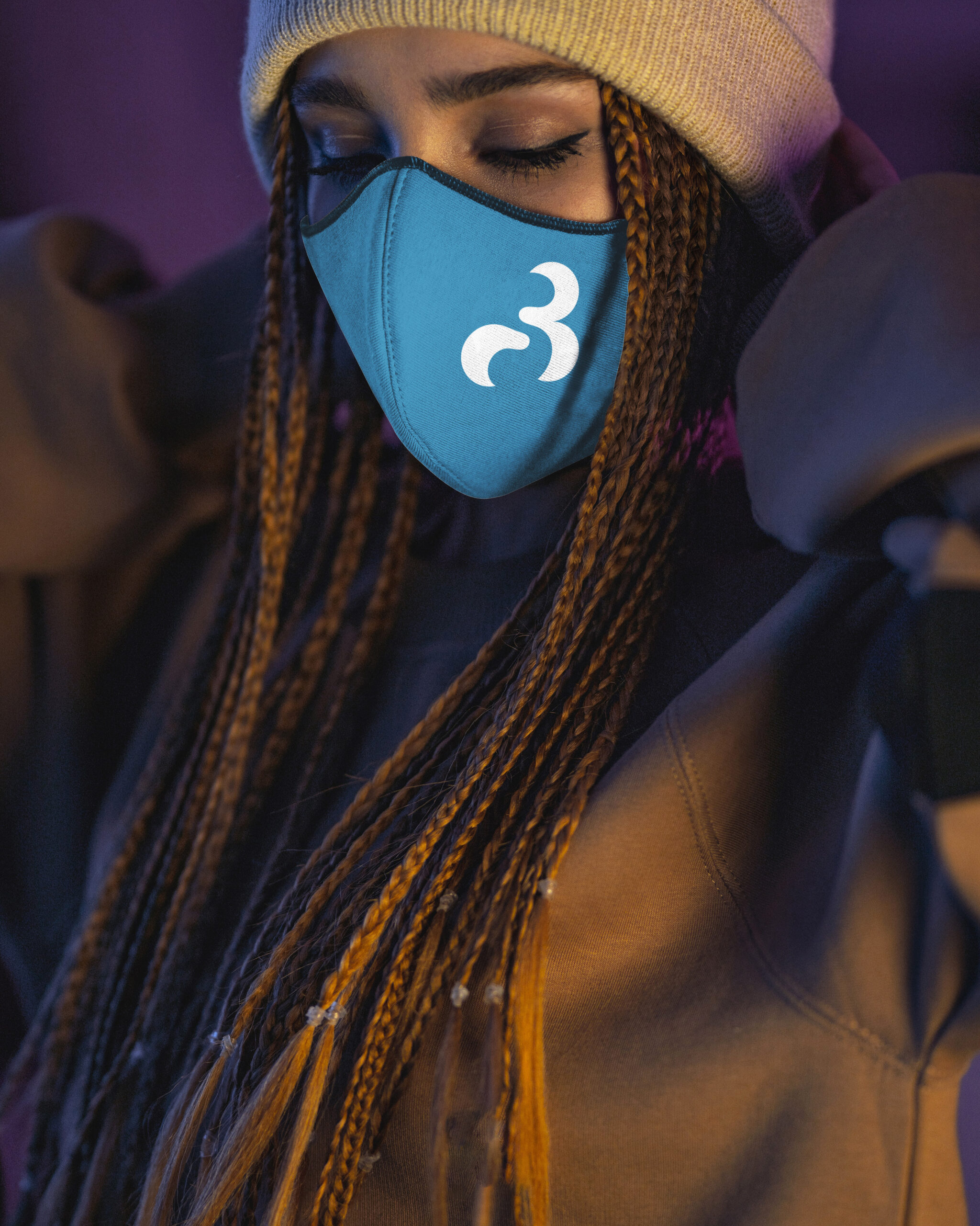
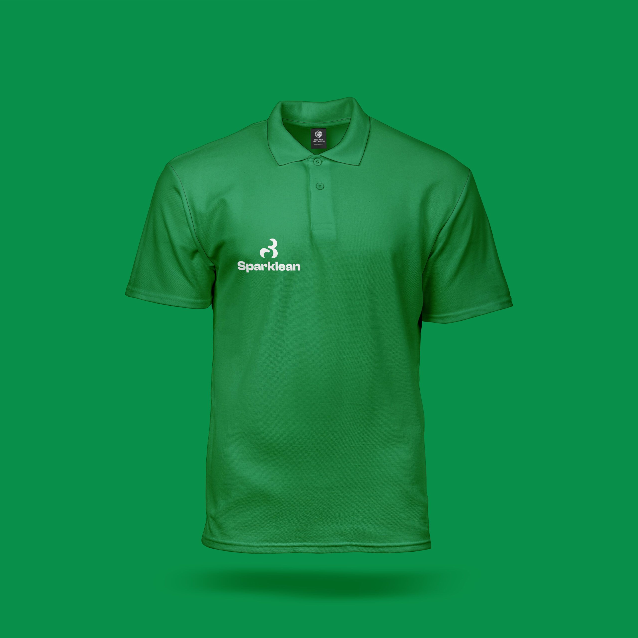
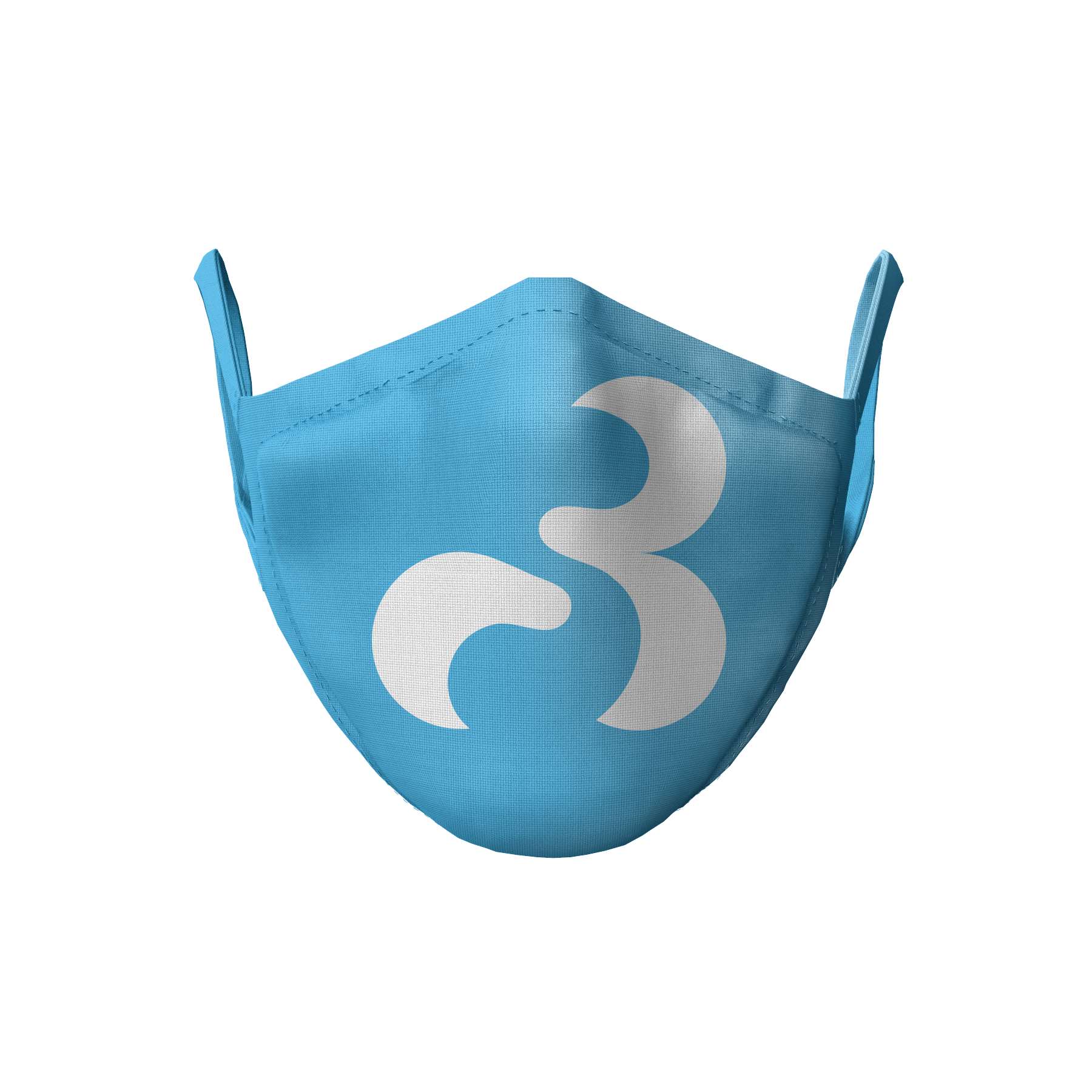
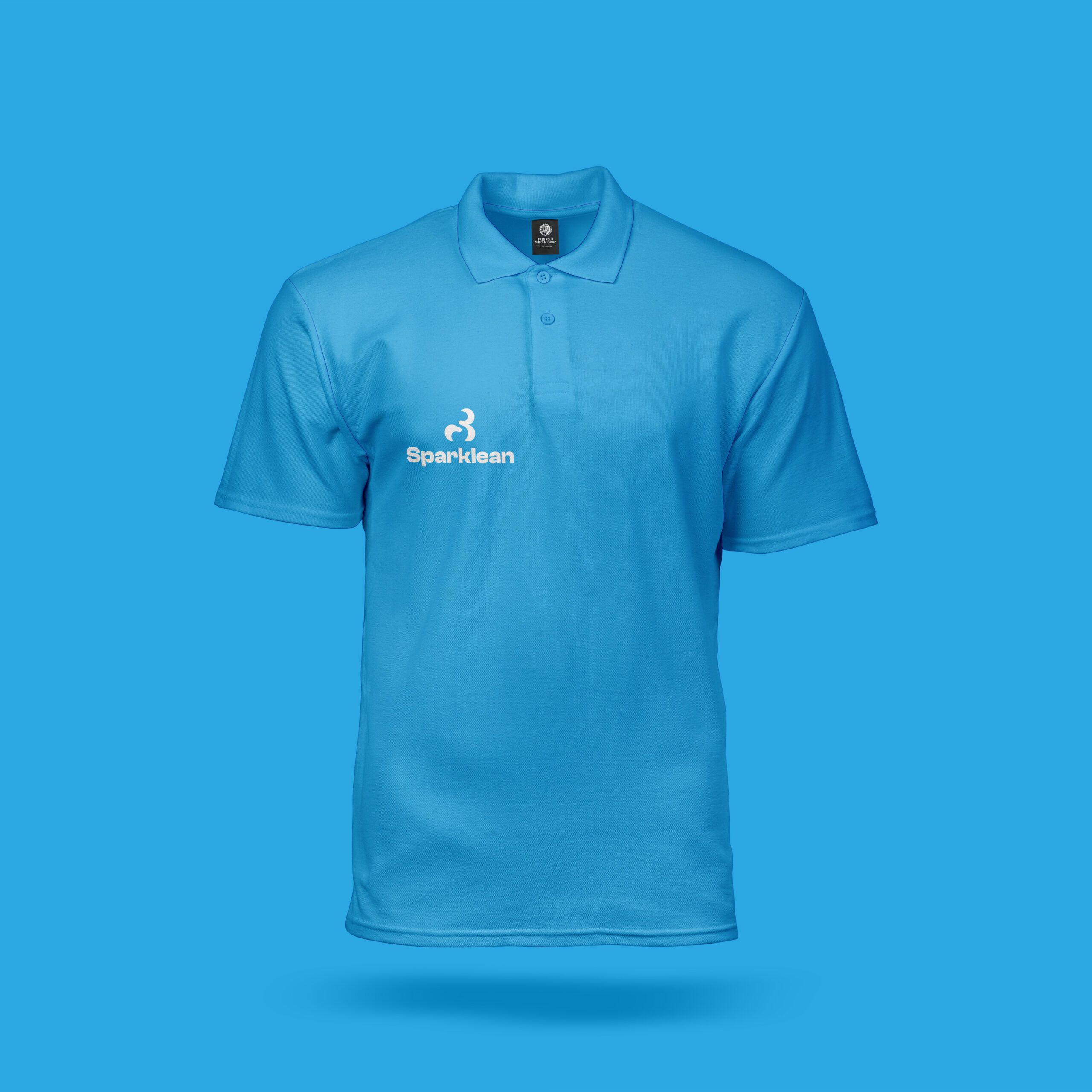
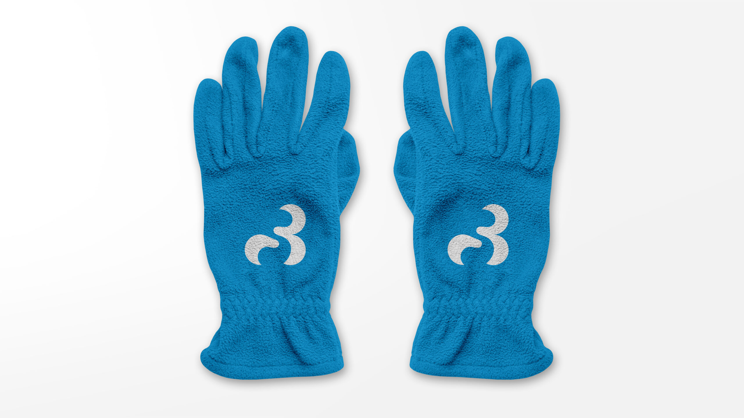
Bitter Kola studio Brand identity strategy for Sparklean, Logo Design:
Colour palettes: The brand colors feature a vibrant blue-green hue (#2aa8e1, R: 42 G: 168 B: 225) that evokes a sense of energy and digital innovation, paired with a deep green (#089049, R: 8 G: 144 B: 73) that represents growth, harmony, and balance, together creating a palette that is both modern and refreshing.
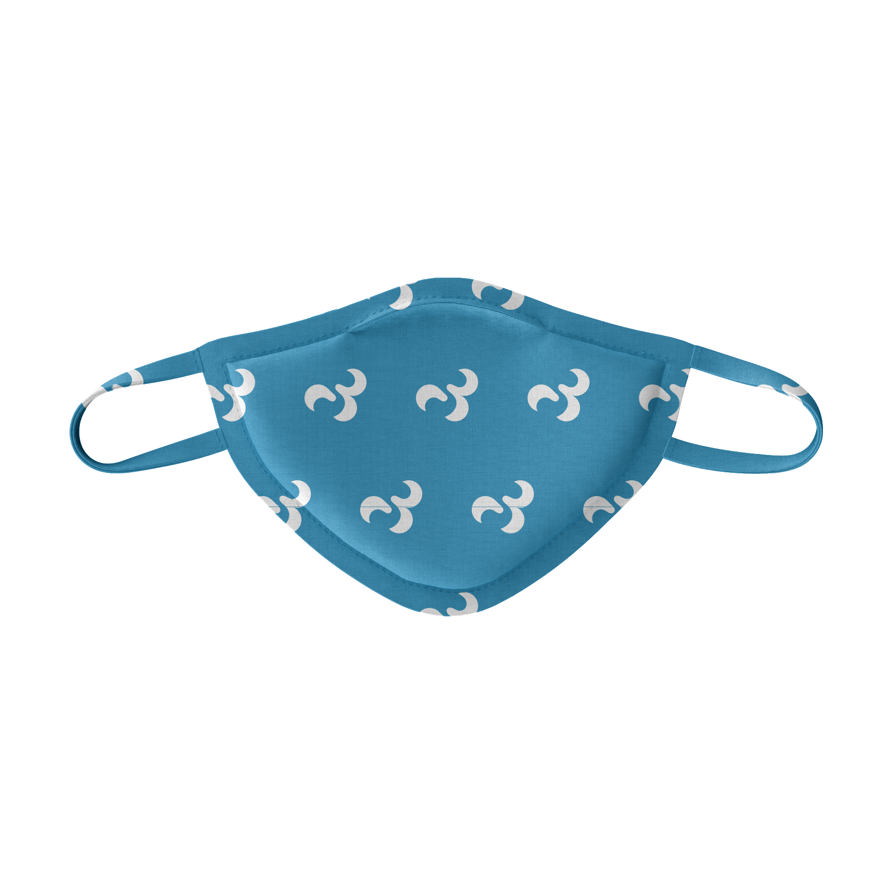
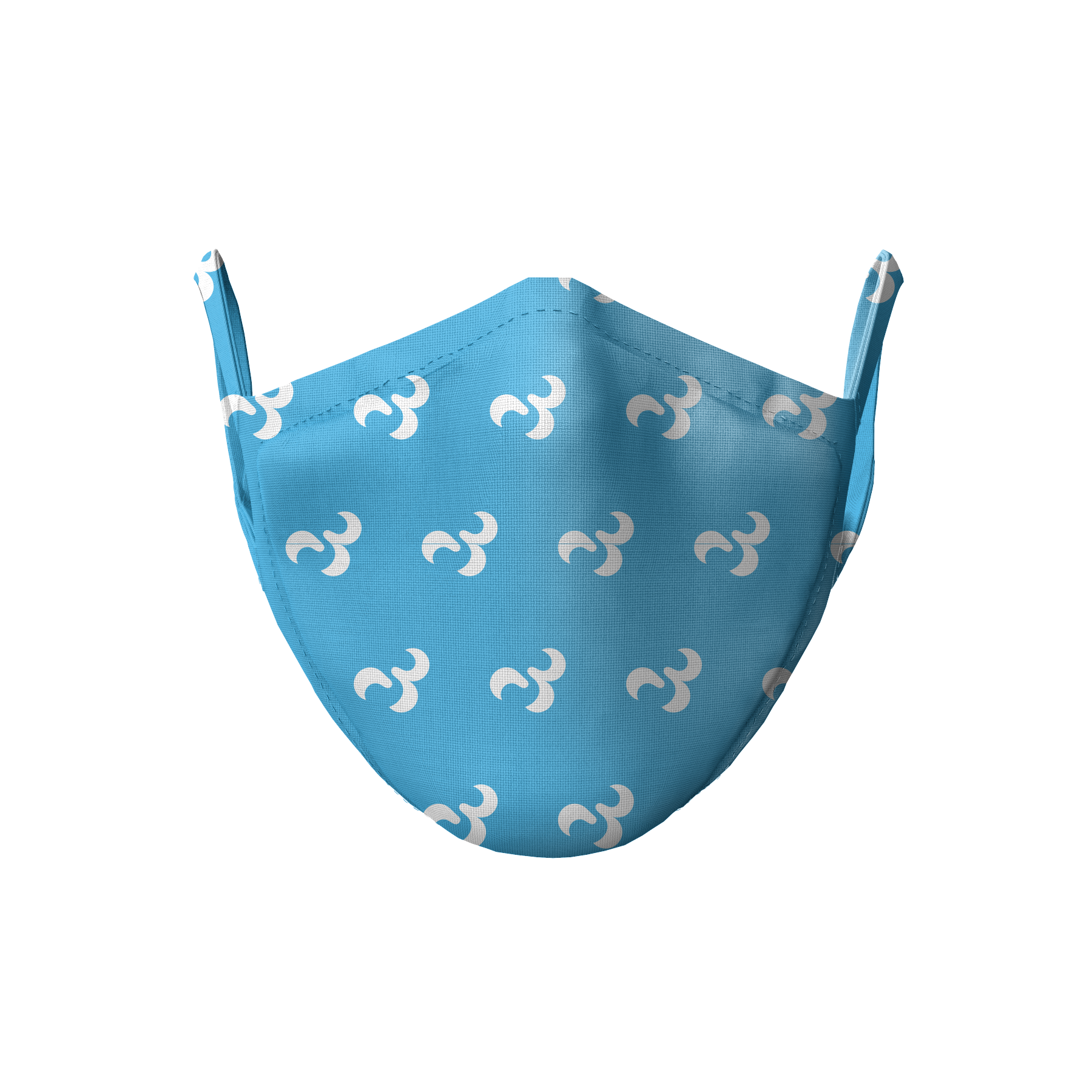
Pattern: The pattern features bubbles forming a wavy, bubble-like playful covering around the shape, creating a dynamic and uplifting visual effect that embodies the spirit of empowerment and inclusivity.